- A gray cat slinks past a wooden house. There’s something a little intimidating attempting to describe.


The Drawings
Illustrating the Guidebook
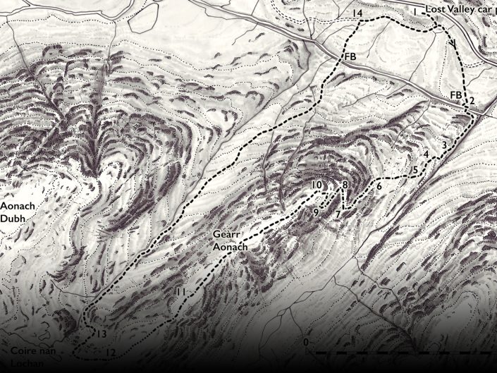
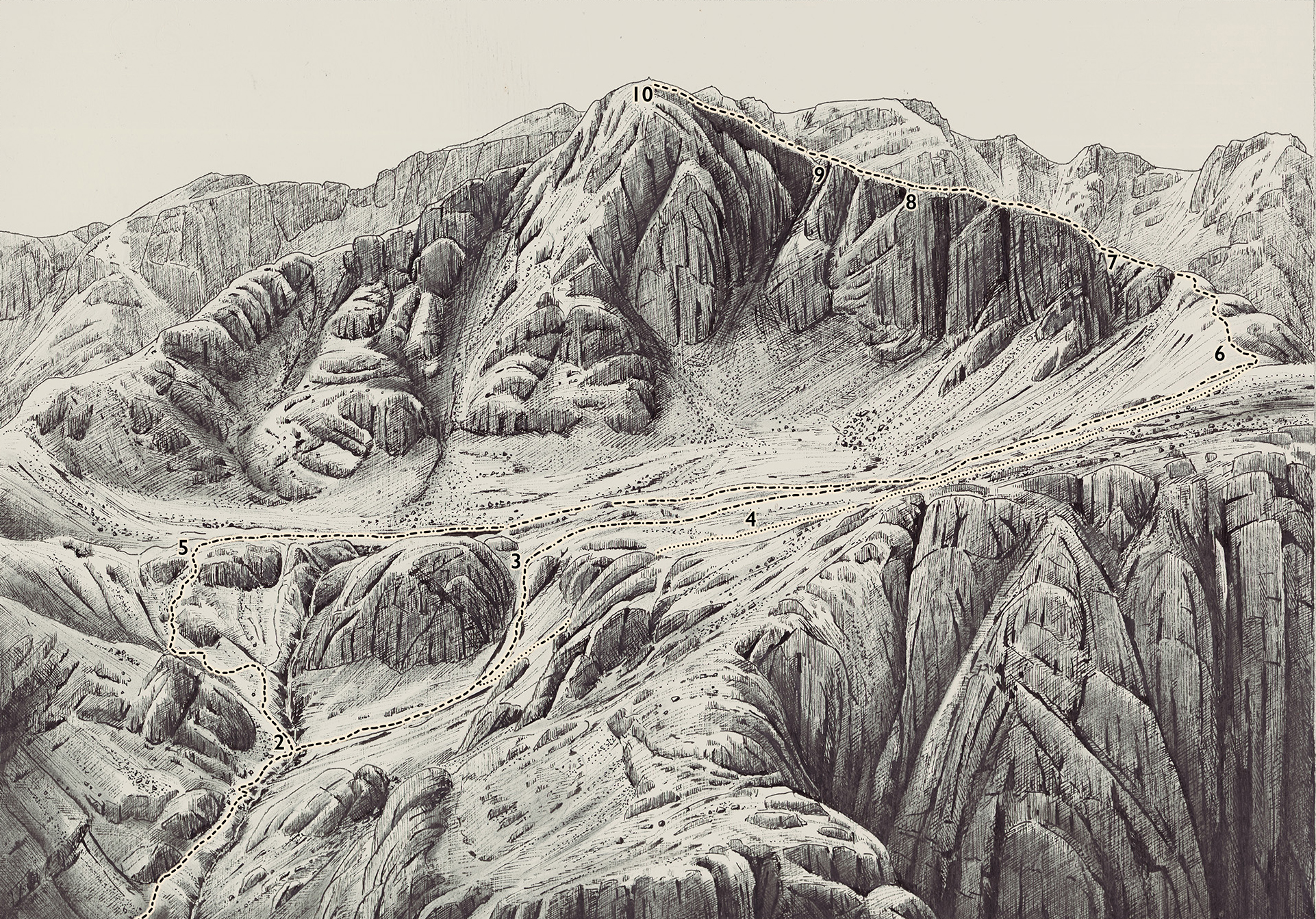
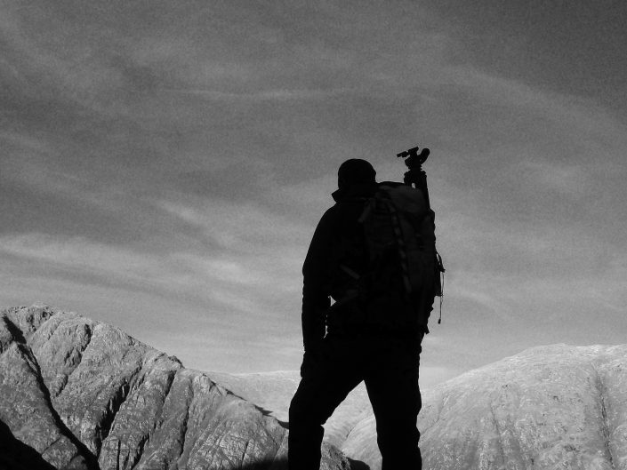
It was decided early on that the walking book should be a visual as well as an informative work. Photography is a wonderful media but can on occasion show a little too much information, particularly over complex ground. The illustrations are a way of showing what needs to be there but without the extraneous detail visible in a photograph.
For each walk, I planned to produce an illustration to clarify the most challenging ground of each walk, within the constraints of a single viewpoint. This concept of a single viewpoint was important to me as I wished to draw all the illustrations from life, out on the hill. In this way I could see exactly what was there as opposed to struggling to see details on a photograph, far removed from the subject. On a purely personal level it is what I enjoy most, sitting out on the hill with a sketchbook. Observation and interpretation are the key, but more than anything just being alone and creatively engaged in a mountain environment that is such a pleasure.
On a practical note the illustrations needed to be extremely accurate and not subject to too much artistic interpretation. In my thirty years as an artist my drawing style has evolved to an extent that I knowingly exaggerate form so naturally that the discipline required for these illustrations was challenging at first. I ended up using a viewing frame, squared up using a sheet of acetate to plot out key features so as not to introduce any topographical distortions.
The illustrations were first drawn out in pencil, sat out on the hill, then rendered in ink back in my studio. I found this the ideal compromise for both accuracy but still with some life to the drawing from the initial work being made outdoors. A heavy weight cartridge paper with a heavy acrylic ground was used. This ground layer has a good ‘tooth’ or texture which gives the ink work character as the pen has a tendency to skip over the surface. The ground also seals the cartridge paper for the paint layer to adhere to. The final stage of the process is a thin, translucent layer of paint to give some tone to the illustration. I wanted the illustrations to have the appearance of a silver gelatine photographic print and to that end I experimented with various ideas for the paint layer. Tests with ink and wash, diluted ink in isopropyl alcohol, watercolour and acrylic paints were made but none had quite the right feel. Finally I found a way of getting the sheen of a photographic print by using powdered graphite bound in a thin glaze of zinc white oil paint. The graphite gave a beautiful silvery sheen and the zinc was translucent so the ink drawing would still be clear underneath.
Recent Portfolios
Introduction
The Book
Our Vision